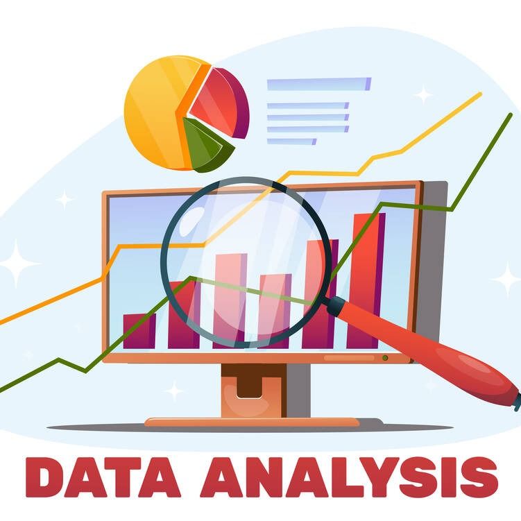
When I first stepped into data analysis, it felt like staring at a giant spreadsheet of chaos and pretending I knew what it meant. At its core, though, data analysis is simply the process of turning raw numbers or text into something helpful: patterns, insights, and decisions. For beginners, the main challenge isn’t the math; it’s knowing where to start and what steps to follow.
Think of data analysis as detective work. You begin with a question—“Why are sales down?” or “Which marketing campaign works best?”—then you gather clues (data), clean them up, and test your theories. The goal is not fancy charts; it’s reliable, actionable answers that help you or your team make better decisions with real-world impact.
Clarify the Question Before the Data
Most beginners jump straight into Excel or Python and quickly get lost. The first real data analysis technique is surprisingly low-tech: clarifying the question. In consulting projects, I’ve seen entire teams collect massive datasets only to realise they never agreed on what problem they were solving.
Before analysing data, define a straightforward, testable question such as: “Did our new website design increase sign-ups?” or “Which customer segment brings the highest lifetime value?” Write it down. Then identify the types of data and metrics you need—conversion rate, revenue per user, churn rate, etc. This simple step saves hours of aimless exploration and helps you choose the right tools and methods later, especially when you’re still learning the basics of analysis.
Collecting Data from the Right Sources
Once you know your question, you need data that genuinely reflects it. Beginners often select whatever is readily available—such as an export from Google Analytics—and hope it tells the whole story. In reality, good data analysis techniques start with thoughtful data collection. For a digital product, this may involve integrating web analytics, CRM exports, and support ticket logs. For a local café, it may involve point-of-sale reports, simple customer surveys, and daily headcounts.
Always note how the data were collected: the time period, the sampling method, and any known gaps. I once worked with a startup that misread user activity because weekend traffic wasn’t tracked properly. The issue wasn’t statistics; it was incomplete data. Treat data collection like building the foundation of a house—if it’s off, everything on top will be unreliable.
Data Cleaning – The Most Underrated Skill
The part nobody glamorises—data cleaning—is where beginners either learn discipline or get burned. Raw data is messy: missing values, inconsistent date formats, duplicate rows, and strange outliers. Early in my career, I relied on a sales report that included test transactions and fictitious accounts; it completely distorted our conversion rate. Now, I always start with a cleaning checklist.
In Excel or Google Sheets, this means checking for duplicates, trimming spaces, standardising formats (dates, currencies, categories), and flagging impossible values (like negative ages or orders with zero price). In tools like Python’s pandas, you’ll use operations to drop or impute missing values and filter out noise. Cleaning may feel tedious, but it’s one of the most critical data analysis techniques, because even the most sophisticated models are worthless if the underlying data is flawed.
Descriptive Statistics: Summarising Your Data

After cleaning, the first technical layer is descriptive statistics—summaries that help you understand what you’re looking at. I always start with simple measures: counts, sums, averages (mean), medians, minimums, maximums, and standard deviation. For example, if you’re analysing monthly sales, the mean tells you the typical performance, while the median helps you see whether a few extreme months are skewing the story.
Standard deviation indicates how much variation there is in the results. For categorical data (e.g., regions, product types), frequencies and percentages reveal which groups predominate. You don’t need advanced math to do this. Excel’s built-in functions or basic scripts give you these numbers quickly. The skill lies in interpretation—spotting whether your data appears stable, volatile, or suspicious before proceeding to deeper analysis or visualisation techniques.
Data Visualisation Basics for Clear Insights
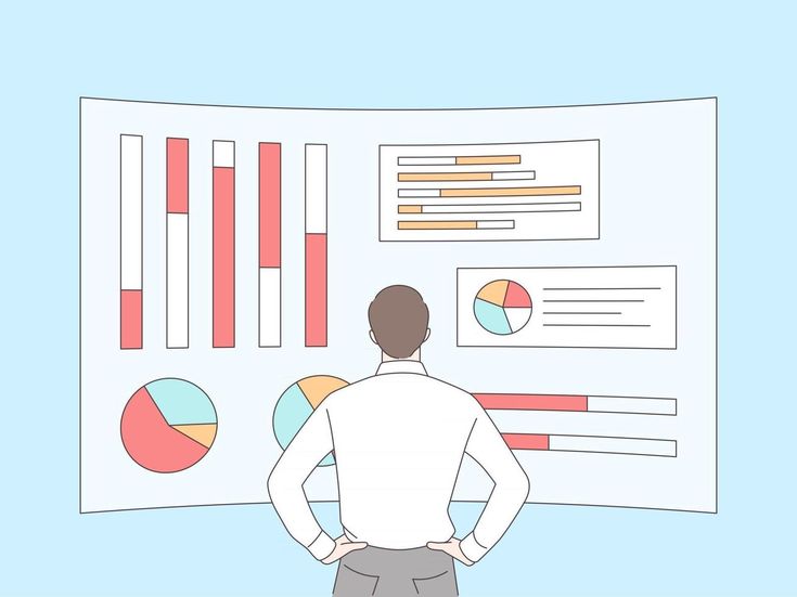
Humans are visual creatures, and the fastest way to communicate insights is usually a good chart, not a giant table. For beginners, stick to a small toolkit of reliable visualisation techniques. Use bar charts to compare categories (e.g., sales by region), line charts to show trends over time (e.g., weekly traffic), histograms to show distributions (e.g., order sizes), and scatter plots to examine relationships between two variables (e.g., marketing spend vs. sign-ups).
I’ve seen many dashboards fail because every chart was a pie chart or a confusing 3D graphic. Clarity beats flashiness. Tools like Excel, Google Data Studio, Tableau, and Power BI make visualisation accessible without coding. The key is to label axes clearly, avoid clutter, and always ask, “If someone new saw this chart, would they understand the main point in five seconds?”
Exploring Patterns: Correlation and Relationships
Once you understand the basics of your data, it’s natural to ask, “What’s connected to what?” Correlation is a simple but powerful data analysis technique for beginners. It measures how two variables move together—like advertising budget and sales, or app usage and churn. A positive correlation means that as one variable increases, the other tends to increase; a negative correlation means that as one variable increases, the other tends to decrease. But correlation is not causation, and I’ve watched teams make costly mistakes by forgetting that.
For instance, we observed a strong correlation between email open rates and revenue, but the actual driver was seasonality. More engaged customers were already more likely to buy, regardless of emails. Use correlation as a clue, not proof. It helps you generate hypotheses, which you then validate with deeper analysis or controlled experiments.
Basic Hypothesis Testing and A/B Experiments
When you want to move from “it looks like” to “we have evidence,” you use hypothesis testing. In practical terms, this often shows up as A/B testing. Let’s say you design two versions of a landing page—A and B—and want to know which converts better. Your hypothesis might be: “Version B increases sign-ups compared to A.” You split traffic randomly, measure conversion rates, and use a statistical test (often a simple proportion test) to see if the difference is likely due to chance.
For beginners, tools such assuch as Google Optimise (now sunset but conceptually sound), Optimizely, or built-in testing in email platforms abstract away most of the math. The critical part is understanding the sample size and the test duration, and avoiding “peeking” too early. Hypothesis testing formalises decision-making rather than relying on intuition.
Practical Tools: Excel, SQL, and a Bit of Python
You don’t need to master every tool to get started with data analysis techniques; in fact, trying to learn everything at once usually backfires. For most beginners, Excel or Google Sheets is the first practical training ground: pivot tables, filters, and basic formulas (SUMIF, VLOOKUP or XLOOKUP, COUNTIFS) are sufficient for meaningful analysis. As your datasets grow, SQL becomes invaluable for querying databases—filtering, joining tables, and aggregating results efficiently.
Python or R occupies the next level: libraries such as pandas, NumPy, and Matplotlib (or ggplot2 in R) providerobustl control over data cleaning, analysis, and visualisation. In my experience, a solid combination is spreadsheets for quick exploration, SQL for structured data, and Python for repeatable, complex workflows. Focus on learning them through real projects, not as an abstract checklist.
Common Beginner Mistakes and How to Avoid Them
Over the years, I’ve seen beginners repeat the same avoidable mistakes. One big one is confusing activity with insight—building beautiful dashboards that don’t answer any real question. Another is ignoring data quality and trusting whatever export lands in their inbox. A third is over-interpreting small samples; for example, concluding that a new feature has failed based on a handful of users.
There’s also the temptation to chase complex models—machine learning, predictive algorithms—before mastering basics like descriptive statistics and proper segmentation. To avoid these traps, always ask: “What decision will this analysis influence?” and “Is my data reliable enough to support that decision?” Also, document your steps. Even simple notes about filters, assumptions, and time ranges help you or your teammates audit the analysis later and build trust in the results.
Ethics, Privacy, and Responsible Data Use
Data analysis isn’t just numbers; it involves real people behind the datasets. Responsible techniques for beginners must include basic ethics and privacy awareness. If you’re working with customer data, you need to understand concepts like consent, anonymisation, and regulations such as GDPR or CCPA. I’ve advised teams that unknowingly store personal identifiers in unsecured spreadsheets, which is a serious risk.
Always minimise the personal data you collect and use; aggregate where possible and avoid exposing individual-level details unless necessary. Be cautious when handling sensitive attributes such as health, income, or location. When presenting findings, avoid reinforcing bias—for example, assuming that a demographic is “less valuable” solely based on short-term metrics. Ethical analysis entails balancing business goals with respect for human rights and long-term trust, ultimately benefiting both users and organisations.
Building Your Learning Roadmap in Data Analysis
If you’re starting, the field can feel overwhelming, but you don’t need to learn everything at once. I usually suggest a staged roadmap. First, get comfortable with spreadsheets: sorting, filtering, pivot tables, and basic charts. Next, learn descriptive statistics and simple visualisation techniques, and apply them to a small, real dataset—maybe your personal finances or website analytics.
Then, introduce SQL for structured data and start exploring joins and aggregations. After that, dip into Python or R for more advanced workflows, focusing on one library at a time. Along the way, read case studies, replicate public analyses, and, most importantly, work on problems you actually care about. Real motivation accelerates learning. Data analysis techniques are best learned through practice, trial and error, and gradually increasing the complexity of questions you’re able to answer.
FAQs
1. Do I need a math background to start with data analysis?
You need basic arithmetic and an understanding of averages, percentages, and simple probability. More detailed statistics will be helpful later, but aren’t required to begin.
2. Which tool should beginners learn first?
Start with Excel or Google Sheets. They’re widely used, approachable, and powerful enough for many real-world beginner projects.
3. How big should my dataset be for valuable insights?
Bigger isn’t always better. Even small, high-quality datasets can reveal patterns, as long as you respect limitations and avoid overgeneralising.
4. How long does it take to become comfortable with data analysis?
With consistent practice on real problems, most people can become reasonably confident with core techniques in three to six months.
5. What’s the most significant skill non-technical people should focus on?
Learning to ask precise questions and interpret results in a business or real-world context is often more valuable than advanced technical skills.


